

Brand Foundation
As the leader in cloud storage and file-sharing software, consistency in its brand representation is of utmost importance to Dropbox. The company's Brand Foundation establishes clear guidelines for representing its valuable brand in a consistent and cohesive manner.
Dropbox's Brand Foundation provides guidelines for the usage of product logos, glyphs and wordmarks. It explains that sub-brand logos represent products within the system, whereas programs and initiatives do not have custom logos. When using product wordmarks, the Dropbox team finds it permissible to utilize an additional color from the brand palette for both the glyph and the product name, ensuring they always match.
To maintain brand integrity, Dropbox also outlines incorrect usage practices. Users are advised against rotating, deconstructing, stretching, or filling in the glyph. Gradients, center lockups, outlined glyph or wordmarks, and colored logotypes should be avoided. Instead, the provided icons should be used when referring to specific applications.
These guidelines serve as a blueprint for maintaining brand consistency, integrity, and recognition across various communications and touchpoints. Clear and comprehensive brand guidelines like Dropbox's empower companies to create a memorable and differentiated brand experience, fostering trust, recognition, and a strong brand presence in the market.
Brand Foundation
The Dropbox logo is a universal signature we use across all our communications. We want it to be instantly recognizable, so consistency is important—please don’t edit, change, distort, recolor, or reconfigure it.

Glyph and Wordmark
Our logo includes both the glyph and wordmark. Please be sure each element is spaced correctly.
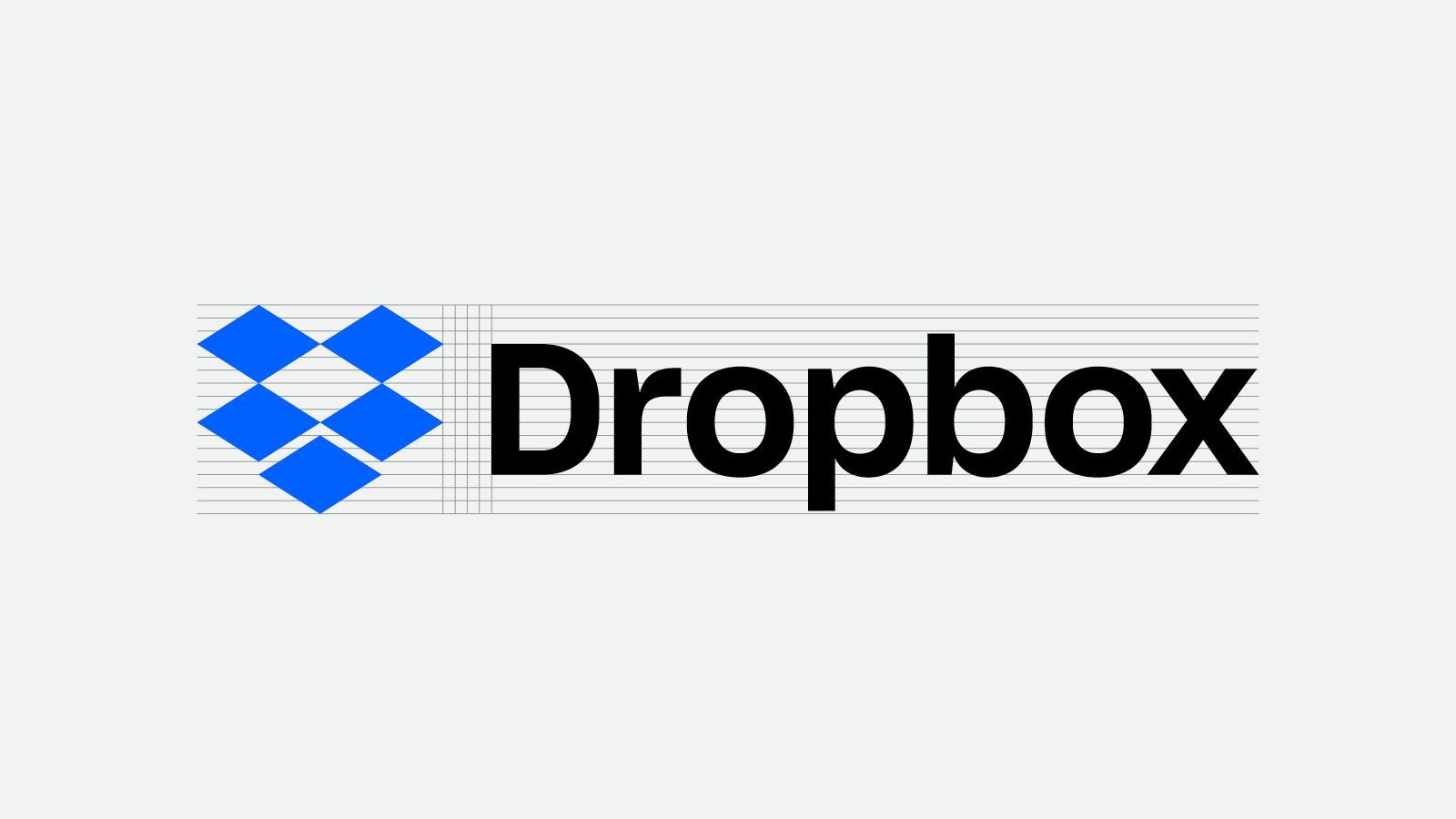
Please use our two-color logo most of the time. Our glyph color may change in special circumstances, but keep the wordmark in white or black.

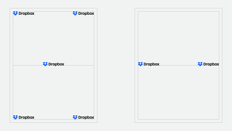
Placement
If you’re creating a composition, please put the Dropbox logo or glyph in one of the four corner areas, or center it on the page.
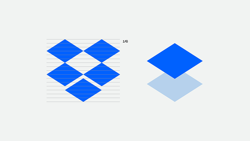
Product glyphs
We have two versions of the Paper glyph, which we redesigned to match the geometry and proportions of the new Dropbox glyph.

The Paper glyph’s height is shorter than the Dropbox glyph—1/6th the height of diamond shorter, to be exact.
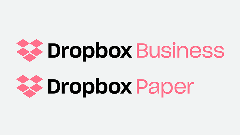
Product wordmarks
Products are the only sub-brand logos within our system. Programs and initiatives don’t have custom logos.
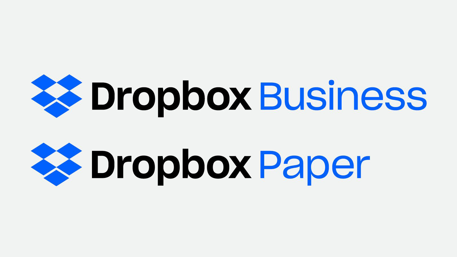
Depending on the context, you can use an additional color from our brand palette for the glyph and the product name. Please don’t put the glyph in one color, and the name in the other. They should always be the same.
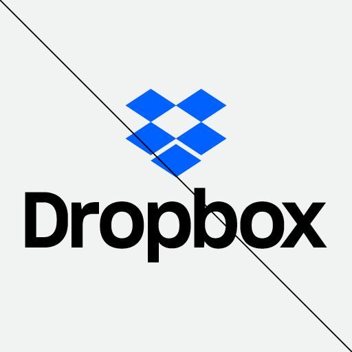
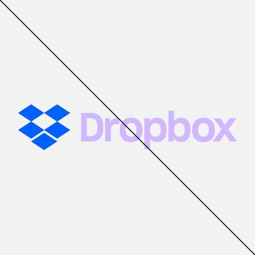
Incorrect use

Do not rotate glyph.

Do not deconstruct glyph.

Do not stretch glyph.

Do not fill in glyph.

Do not use wrong colors.

Do not use gradients.
Do not center lockup.
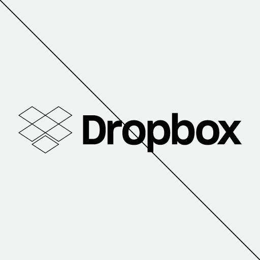
Do not outline glyph or wordmark.
Do not color logotype.
Application icons
Please use our icons when mentioning specific applications.


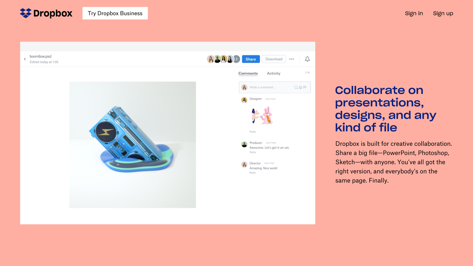
Product Screenshots
We use Product Screenshots when speaking to our current product offerings. Opposed to relying on a metaphoric narrative, we felt that referencing the physical product would help these educational moments make more sense.
Feel free to use unaltered screenshots for instructional purposes. Please don't superimpose graphics, change the way our products look, or include any user information in your screenshots. You can annotate as long as the annotations are clearly distinct from the original screenshot. You can find our screenshots in our press kit.
Use of our brand materials
In general
Please don't use our name, logos, or screenshots ("brand materials") in ways that may be confusing, misleading, or suggest our sponsorship, endorsement, or affiliation. For example, your name and logo should be more prominent than the Dropbox name or logo. And please don't edit or change the Dropbox logo — we like it how it is!
Advertising, promotional, and sales materials
Please check in with us before using our logo on websites, products, packaging, manuals, or for other commercial or product use. It's ok to say in text "works with Dropbox" or "compatible with Dropbox" (as long as it's true!).
Education and instruction (books, guides, publications, and conferences)
You can use our brand materials for educational and instructional purposes, but please remember that it shouldn't be confusing or misleading, or suggest our sponsorship. We generally don't allow use of our logos or screenshots on book covers, for example.
Also remember to include this statement (or something like it) in your printed materials: "(Title) is not affiliated with or otherwise sponsored by Dropbox, Inc."
Products, websites, names and logos
Please don't use our name as a part of your company or service name, website name, trade name, or product name. Don't use our logo or incorporate our logo into yours. Don't use a domain name containing "dropbox" or any confusingly similar words.
Functional Uses (UIs / buttons)
Developers of our API can use brand materials in accordance with our Developer Branding Guidelines.
Linking to Dropbox
If you use Dropbox and want to use our logo to link to our site, you can use our logo if it meets the rest of these guidelines. For example, "we use Dropbox! [linked logo or link near logo]" or "here's a photo set (hosted on Dropbox!)."
Merchandise
While we make lots of t-shirts with our logo on them, we don't generally allow third parties to make, sell, or give away anything with our name or logo on it.
As the leader in cloud storage and file-sharing software, consistency in its brand representation is of utmost importance to Dropbox. The company's Brand Foundation establishes clear guidelines for representing its valuable brand in a consistent and cohesive manner.
Dropbox's Brand Foundation provides guidelines for the usage of product logos, glyphs and wordmarks. It explains that sub-brand logos represent products within the system, whereas programs and initiatives do not have custom logos. When using product wordmarks, the Dropbox team finds it permissible to utilize an additional color from the brand palette for both the glyph and the product name, ensuring they always match.
To maintain brand integrity, Dropbox also outlines incorrect usage practices. Users are advised against rotating, deconstructing, stretching, or filling in the glyph. Gradients, center lockups, outlined glyph or wordmarks, and colored logotypes should be avoided. Instead, the provided icons should be used when referring to specific applications.
These guidelines serve as a blueprint for maintaining brand consistency, integrity, and recognition across various communications and touchpoints. Clear and comprehensive brand guidelines like Dropbox's empower companies to create a memorable and differentiated brand experience, fostering trust, recognition, and a strong brand presence in the market.

