

Logo Usage Guidelines
Medium, a leading online publishing platform, takes an opinionated stance on maximizing the full potential of its brand in its Logo Usage Guidelines.
The Medium logo takes center stage as the team's primary graphic device. It demands attention and therefore is their go-to choice. It showcases a stunning fusion of symbol and wordmark, each capable of standing alone or together in perfect harmony. As the logo represents the face of the Medium brand, consistency is key. Each element was meticulously crafted to achieve visual harmony and should never be altered. Clearspace and margin guidelines are also essential, giving the logo room to breathe, as well as the space to shine with at least the cap height from the wordmark as clearspace.
Medium's logo guidelines demonstrate the impact and true potential of using a logo in a consistent and cohesive manner, protecting and enhancing the value of the Medium brand in the eyes of its audience.
Medium Logo and Usage Guidelines
Download Medium’s logo assets here
The Medium wordmark and icon are the primary expressions of our brand identity. They have each been carefully designed and constructed to achieve visual harmony, should never be altered, modified, or redrawn. Because these elements are such recognizable and highly visible brand assets, it is vital that that they are always applied consistently.
These few simple rules will help you use our wordmark and icon to represent the Medium brand most effectively.
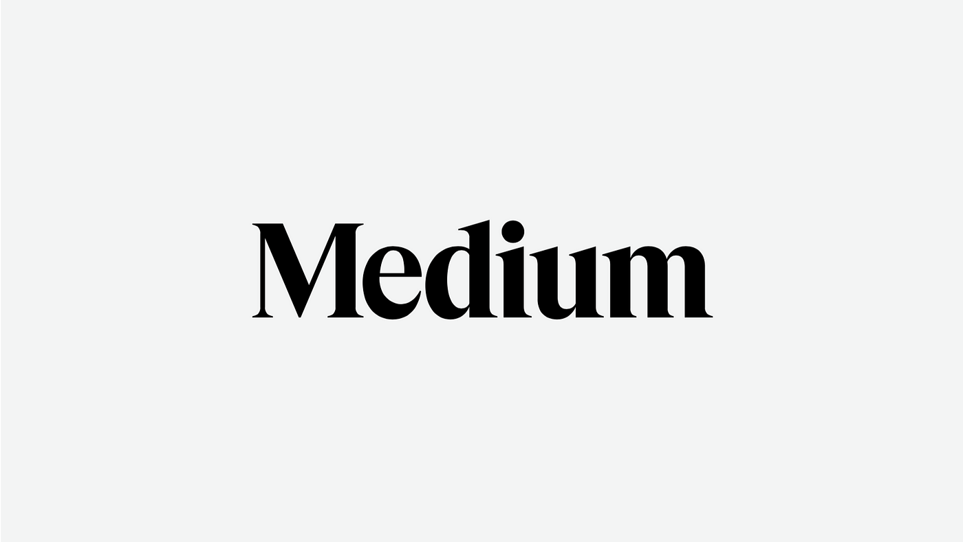
Wordmark
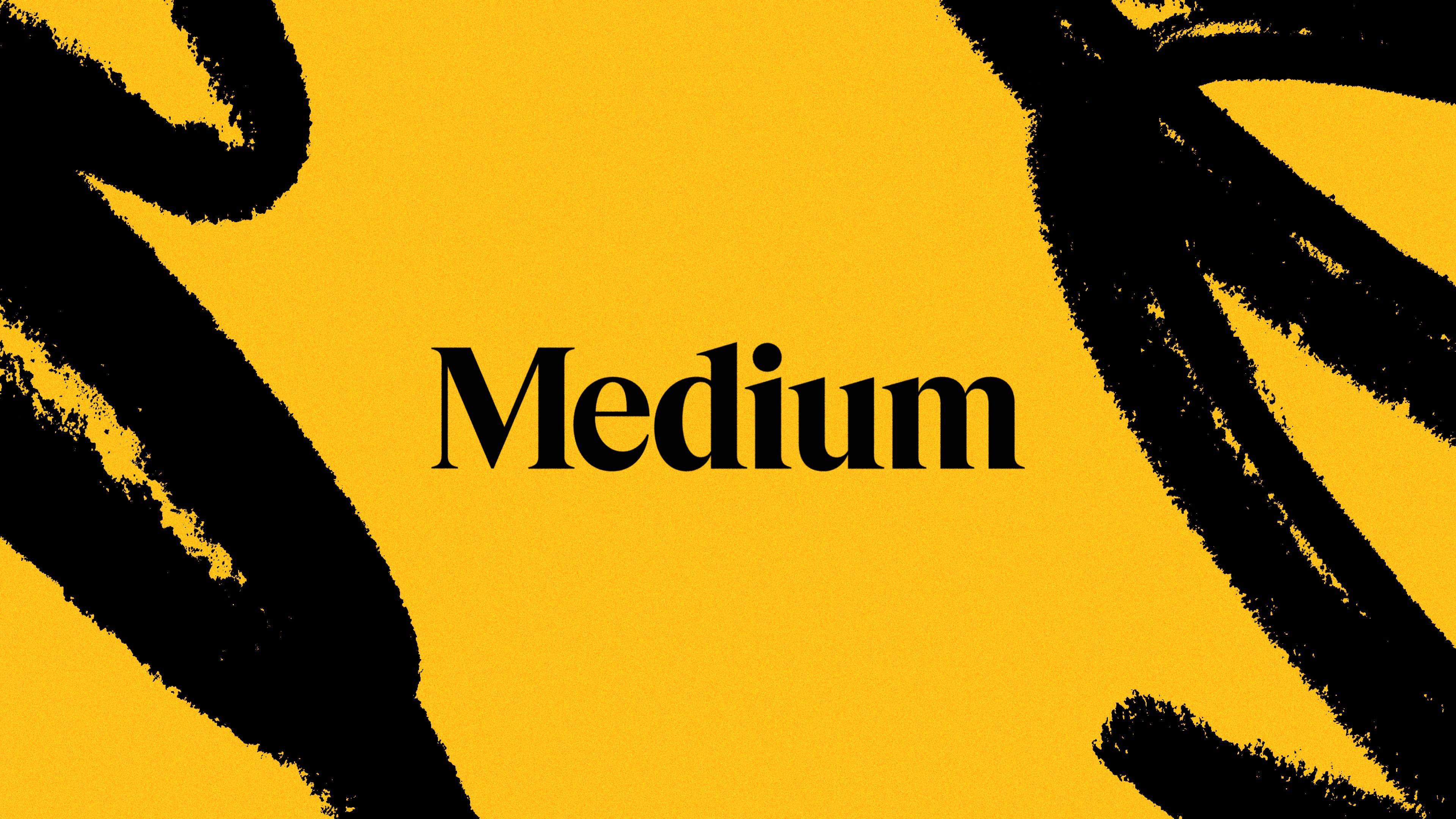
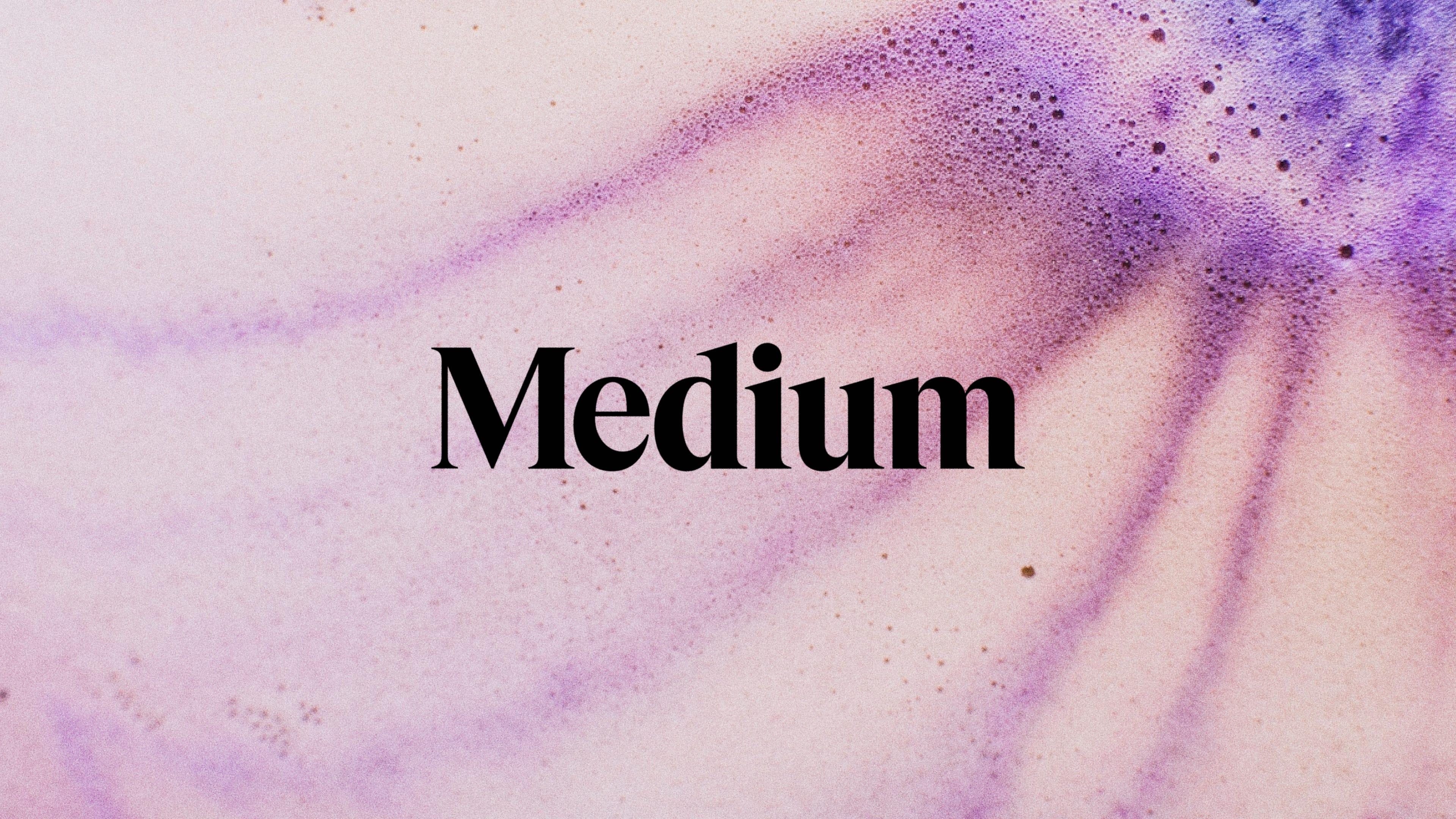
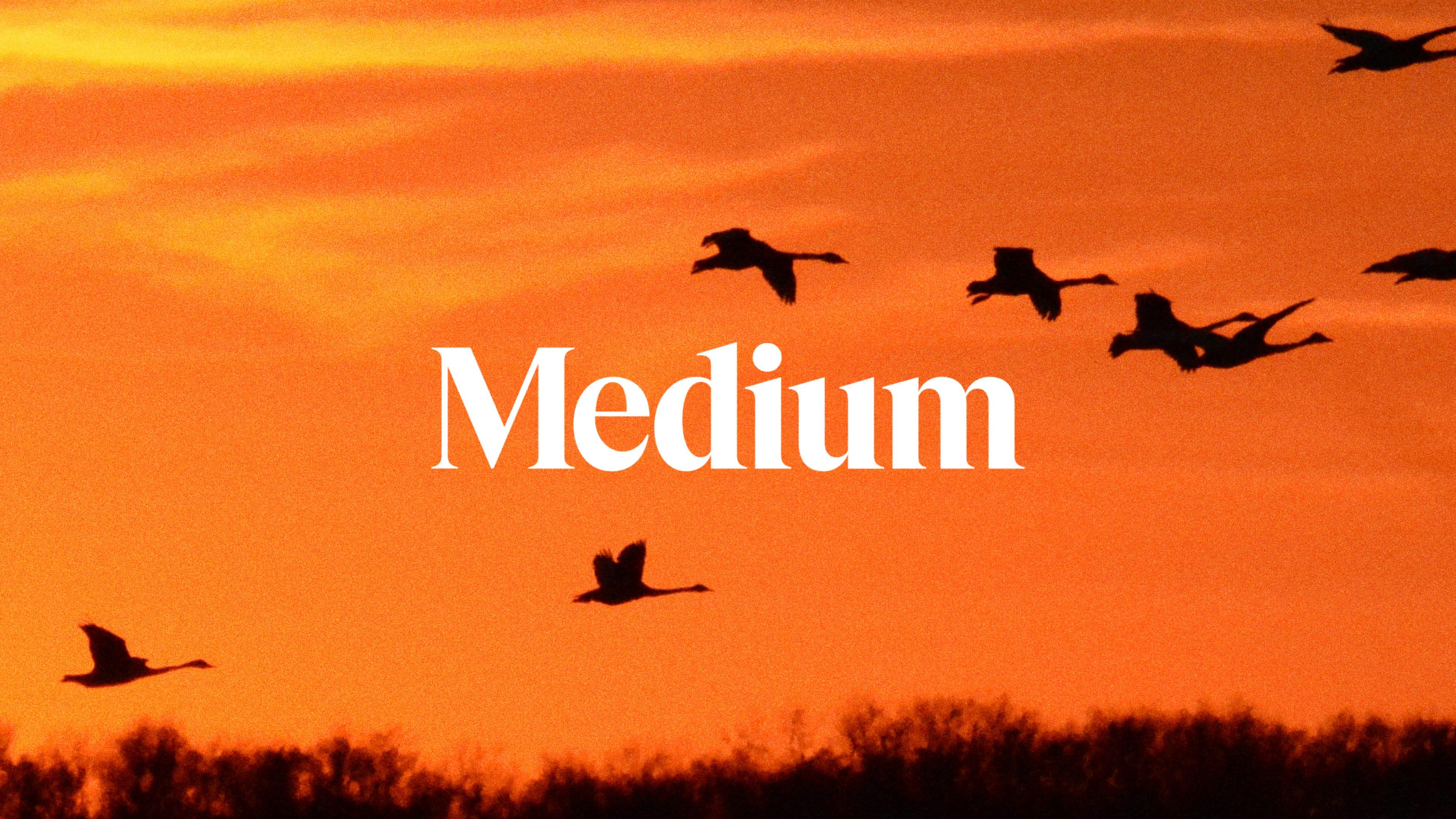
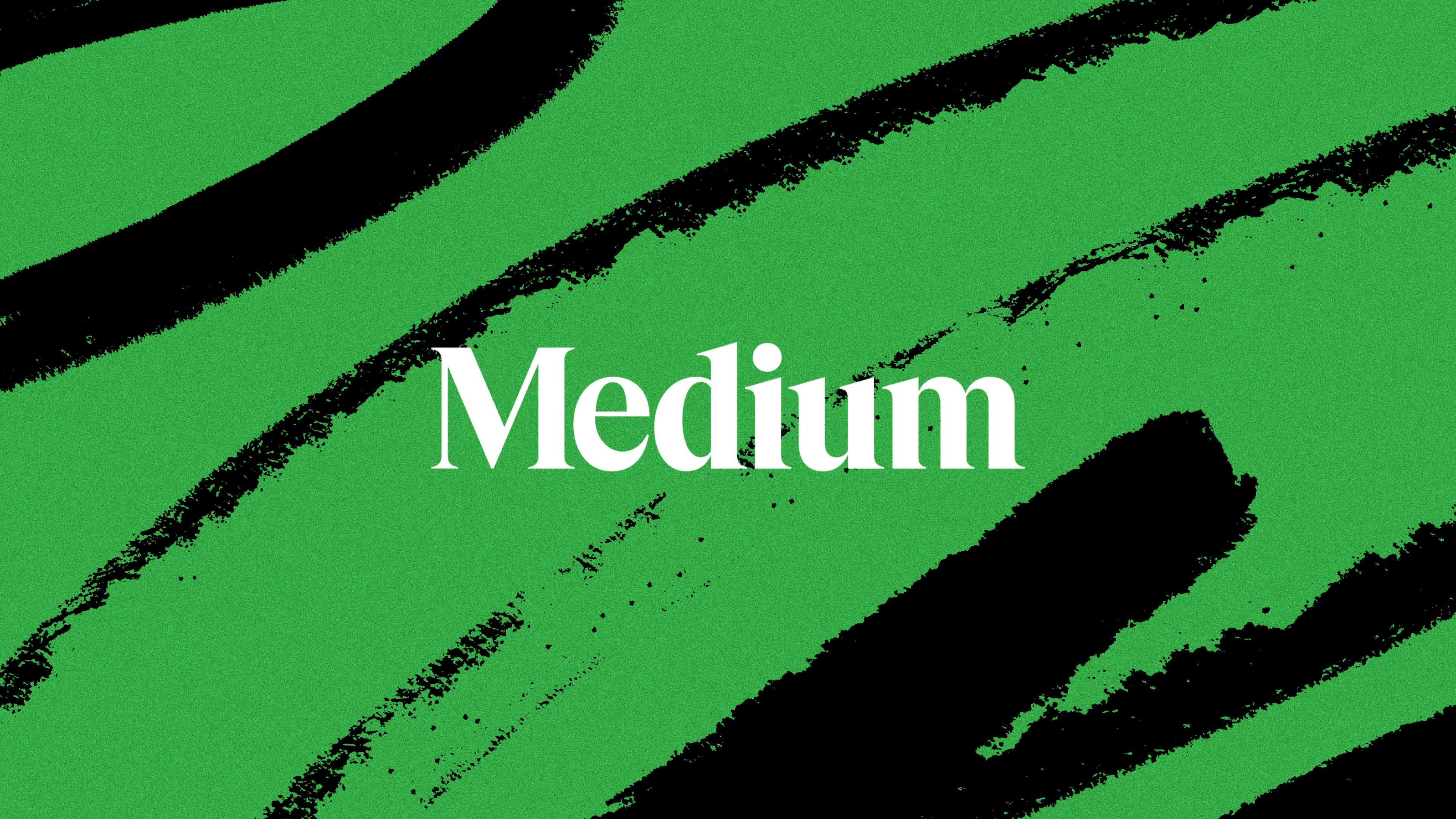
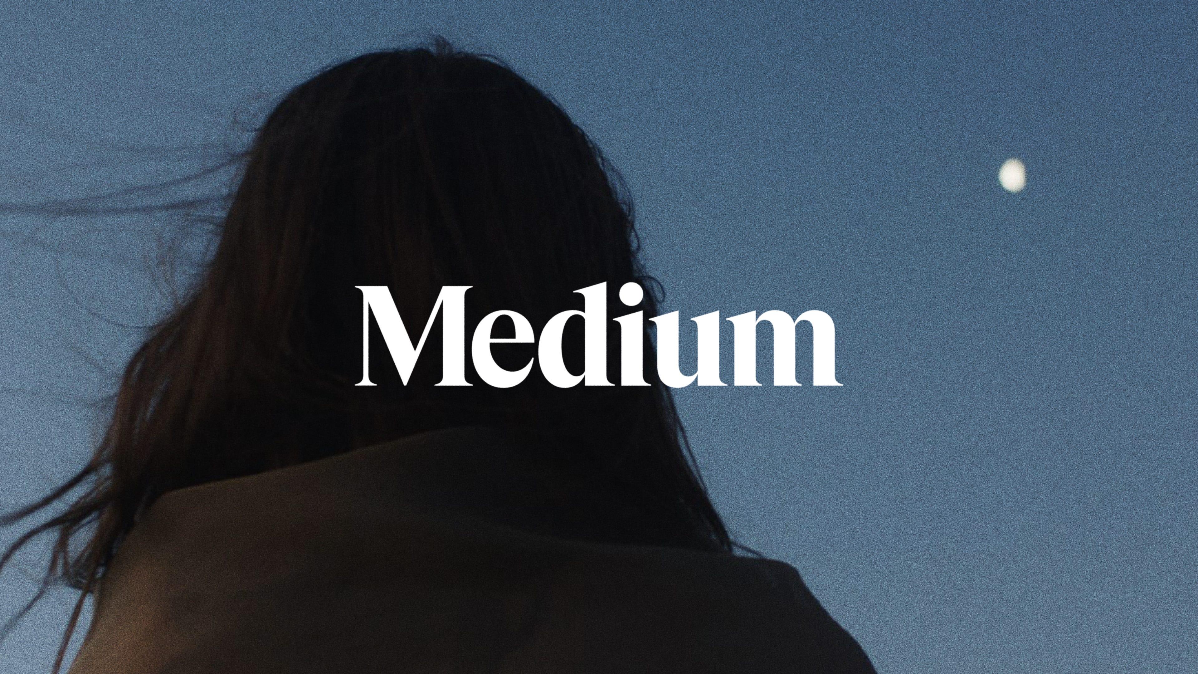
This is the Medium wordmark. It is our primary graphic device and should be the first choice when choosing a graphic element to represent the Medium brand.
The wordmark should be used in any instance where the canvas space is not restrained to a 1:1 ratio container. Examples include press story images, banner images, responsive websites, or video thumbnails.
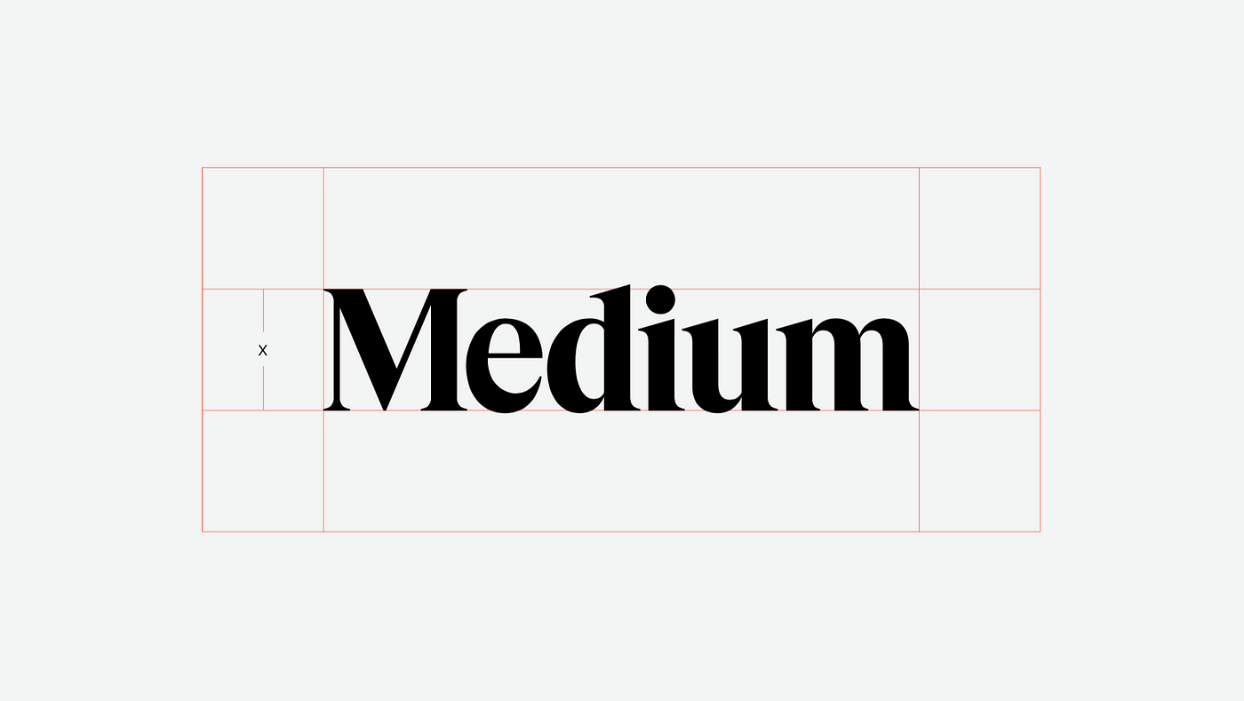
Wordmark clear space
When using the wordmark in a design or placing it next to other visual elements, you should ensure that it has plenty of room to breathe. This is a great rule-of-thumb for any design elements, not just Medium’s wordmark.
The wordmark’s clear space defines the distance between the wordmark and any graphic element it may be sitting next to in a composition. Use the height of the wordmark as a reference for the appropriate clear space.
For example: if you were to place the Medium wordmark, sized 30px tall, in a set next to other logos, you should ensure that the Medium logo has at least 30px of clear space on all sides.
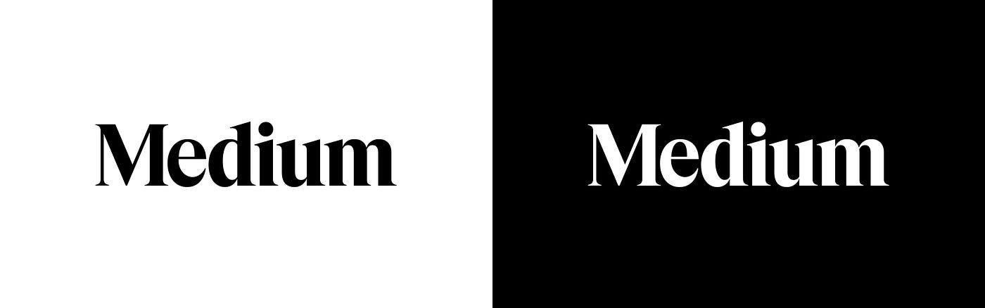
Color and background
The Medium wordmark should be kept in black or white only. It should not be treated in any other colors, gradients, or filled with images.
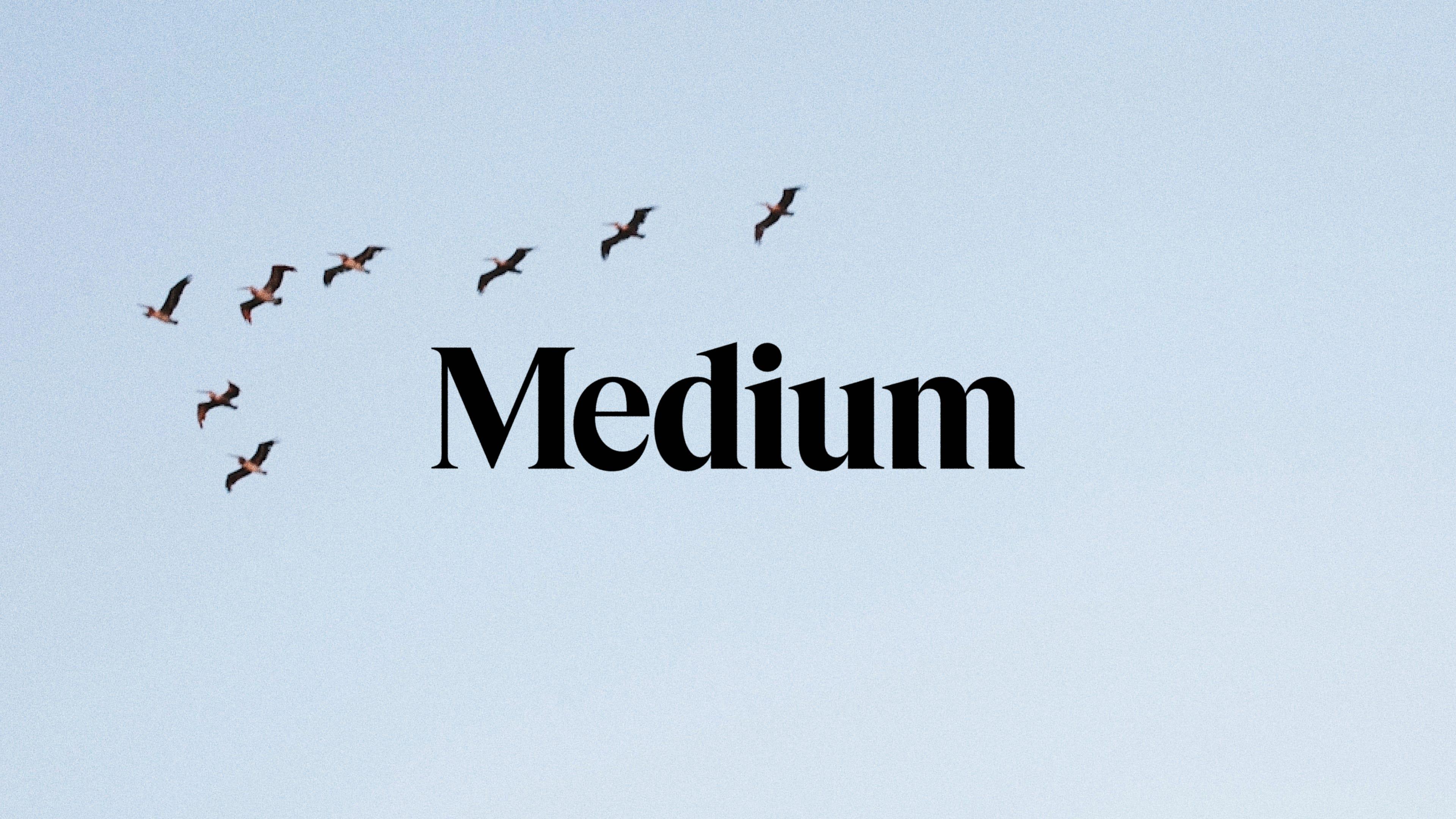
The wordmark can be used on top of images or colorful backgrounds. Ensure that there is adequate contrast and that the Medium wordmark is legible, with minimal interference from the subject matter of the image.
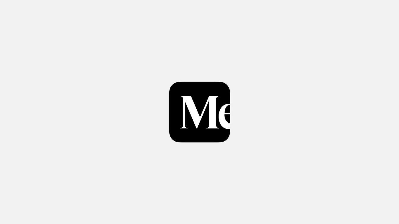
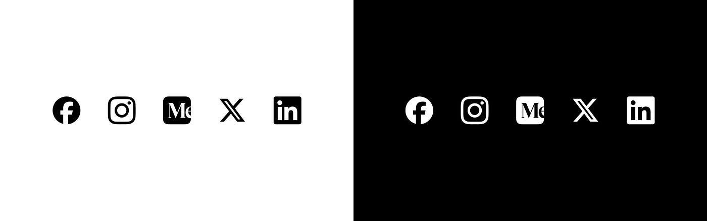
Icon\nThis is the Medium icon. It utilizes the Medium wordmark so that the M is visually centered within its container. It is best used as a secondary identifier when an association with Medium has already been established. It is the app icon for the Medium mobile app and the favicon for Medium on the web.\nThe icon can be used in any instance where the canvas space is exclusively restrained to a 1:1 ratio container. Examples include a list of app icons, a user avatar by an official Medium profile, or a set of linked social media icons on a personal website.\n
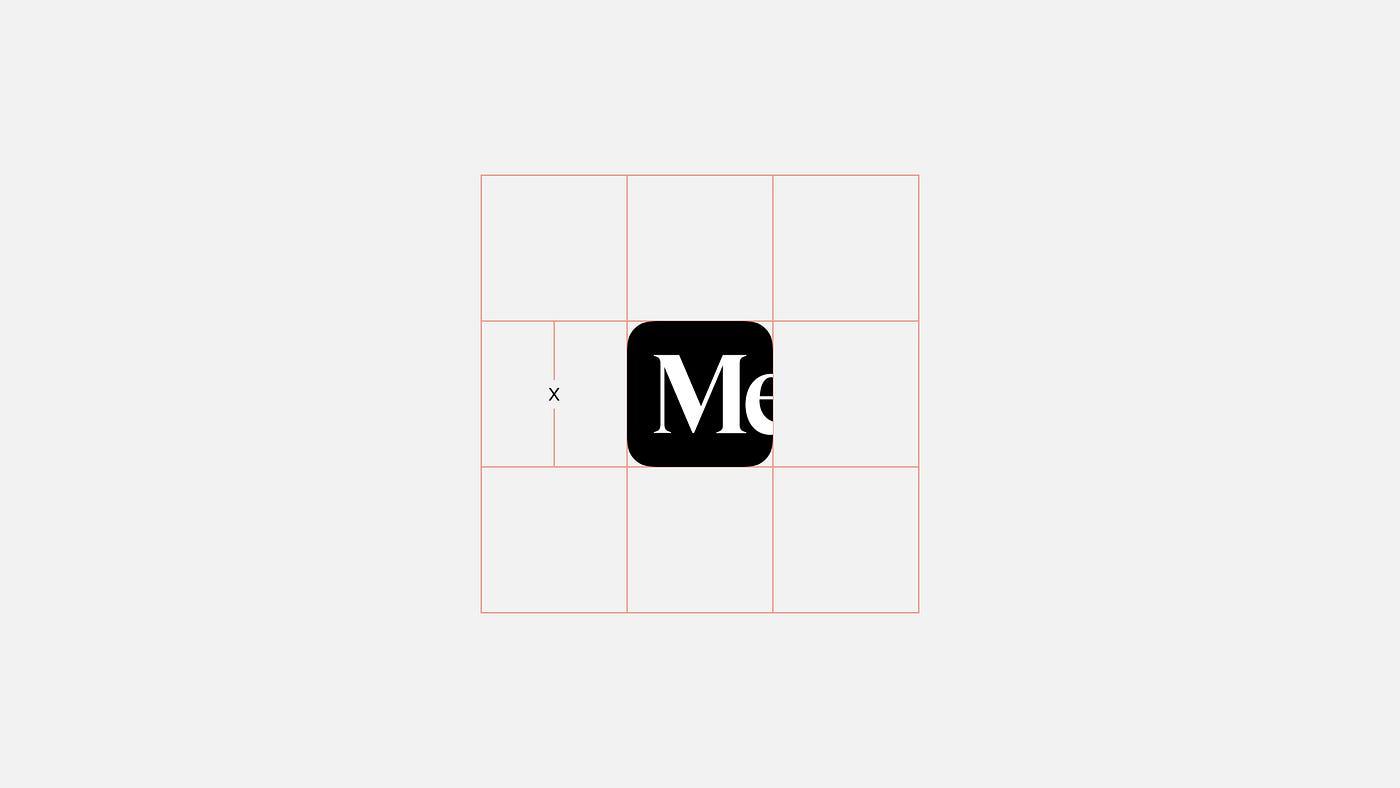
Icon clear space\nThe same general rules for clear space and margins that apply to the logo and wordmark also apply to the symbol. Use the height as a guide and try to give the Medium icon adequate breathing room around all sides.\n
Medium, a leading online publishing platform, takes an opinionated stance on maximizing the full potential of its brand in its Logo Usage Guidelines.
The Medium logo takes center stage as the team's primary graphic device. It demands attention and therefore is their go-to choice. It showcases a stunning fusion of symbol and wordmark, each capable of standing alone or together in perfect harmony. As the logo represents the face of the Medium brand, consistency is key. Each element was meticulously crafted to achieve visual harmony and should never be altered. Clearspace and margin guidelines are also essential, giving the logo room to breathe, as well as the space to shine with at least the cap height from the wordmark as clearspace.
Medium's logo guidelines demonstrate the impact and true potential of using a logo in a consistent and cohesive manner, protecting and enhancing the value of the Medium brand in the eyes of its audience.

