Upcoming CSS Features to Look Forward to
A preview of new CSS features that improves code quality and user experience.
CSS specs and implementations have rapidly improved in recent years. Engineers are more than ever freed from ancient tricks like clearfix. Instead, they can truly focus on delivering a great user experience. In this article, we will look at some CSS features on the horizon that we at Slab can't wait to use.
Container Queries
You are already familiar with the screen size media queries. We use them extensively at Slab for our mobile web support.
However, querying on screen size is limiting. Taking our post page as an example, to deliver the best reading experience, we expand comments based on the available width. This width is not only determined by the window width but also by the site sidebar's collapsed state.
Today, we rely on additional classes added using JavaScript to indicate the sidebar state along with media queries. This is what a simplified code looks like:
$sidebarWidth: 200px;
$mobileBreakpoint: 680px;

.post-view {
  @include wideStyle;

  &.sidebar-collapsed {
    @media (max-width: $mobileBreakpoint) {
      @include narrowStyle;
    }
  }

  &.sidebar-expanded {
    @media (max-width: $mobileBreakpoint - $sidebarWidth) {
      @include narrowStyle;
    }
  }
}
Container queries, a new CSS feature, will remove the reliance on JavaScript and make code easier to read. Container queries are similar to media queries, except that the former queries against a DOM node instead of the entire viewport.
.post-view {
  @include wideStyle;
  container-type: inline-size;

  @container (max-width: 480px) {
    @include narrowStyle;
  }
}
To learn more about the syntax, check out this demo.
Cascade Layers
"Cascading" is literally in CSS's name. It's a fundamental feature. But managing specificity in a large app is not always easy. We've probably all encountered bugs caused by accidental style overrides.
When overriding external libraries' default styling, we are also often limited by their specific selector choice to match the specificity. Take our own rich text editor, Quill, as an example. It defines styles for list items with the selector li:not(.ql-direction-rtl) to ensure they only apply to languages written from left to right. So if you want to override Quill's list style, you'd need to include the :not(.ql-direction-rtl) part to match the specificity of the original rule:
@import 'quill/theme.css';

li,
li:not(.ql-direction-rtl) {
  /* Our styles go here */
}
CSS cascade layer provides a way to simplify, as it divides the CSS definitions into multiple layers, with CSS specificities isolated inside each layer.
We use @layer to define layers and specify their priorities:
/* Layers are defined from lowest priority to highest */
@layer quill, application;
With all layers defined, we can add styles to each layer and safely assume that, in our case, styles in the application layer will always have a higher priority than styles in framework, without worrying about specificity:
@layer quill {
  @import 'quill/theme.css';
}

@layer application {
  li {
    /* Our styles go here */
    /* Styles defined here ALWAYS take priority over styles in quill ✌️ */
  }
}
:has() Pseudo-Class
Many of you know about :has() from jQuery. :has() is used to select a node whose descendants match the supplied selector. For example, $('figure:has(> figcaption)') will find all <figure> that have a caption element as their direct child.
However, developers never had a chance to use it in their CSS code as no browsers supported it until very recently.
jQuery supports :has() because it was in the spec of CSS 3 selectors, and jQuery aimed to support all those selectors. However, :has() was postponed due to performance and complexity concerns. You can learn more about why performance is a concern from this blog post, written 12 years ago 😄.
Safari 15.4 is the first browser that provides :has() in CSS, allowing you to use the pseudo class directly in CSS as you did in jQuery:
figure:has(> figcaption) {
  border: 1px solid #ccc;
}
Without :has(), we would have to determine whether figure contains figcaption in JavaScript, and add different classes to figure to give it a different style.
Accent Color
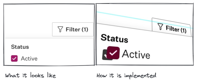
HTML form controls, outside of text inputs, are hard to customize. The lack of browser support often leads to fully customized checkbox/radio controls. For example, at Slab, we create our pseudo checkbox/radio out of necessity to match our general UI style.

Such a solution adds complexity to the code. It also often leaves out the accessibility support.
The good news is major browsers have recently provided a new CSS property accent-color to set the accent color of controls. If we want to make checkboxes red when they are checked:
input[type="checkbox"] {
  accent-color: red;
}
Isn't that a lot easier? You can take a look at how this property works on different controls:
VirtualKeyboard API

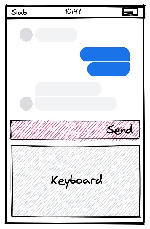
If you're an iOS developer, you're familiar with inputAccessoryView. It is a view that sits on top of the soft keyboard. This UI pattern is extremely common in real-world apps: a messaging app like the one shown in the diagram usually has the send button on top of the soft keyboard. Slab also has a similar view for post comments on mobile devices.
However, it isn't easy to achieve a similar effect with CSS. There is no native positioning rule that puts an element above the soft keyboard. There is also no good API to get the height of the keyboard for manual positioning. The only one that could work is to leverage VisualViewport API, but it would be very laggy because all the calculations are done in JavaScript. During scrolling, the user experience is quite bad.
VirtualKeyboard API provides the proper solution. Luckily, Chrome has already implemented the support. The standard provides not only JavaScript APIs but also a set of CSS environment variables that describe the size of the soft keyboard. The following code uses keyboard-inset-height to make .send-button always stays on top of the keyboard:
.send-button {
  position: fixed;
  bottom: 0;
  margin-bottom: calc(20px + env(keyboard-inset-height));
}
If the soft keyboard is closed, keyboard-inset-height is 0, so .send-button stays at the bottom. When the soft keyboard opens, the value becomes the height of the keyboard, making .send-button the same distance from the bottom as the height of the keyboard.
VirtualKeyboard API is a pure CSS solution, so it works much more smoothly than calculating every frame in JavaScript. You can also add animation effects with transition: margin-bottom.
Scrollbar Gutter

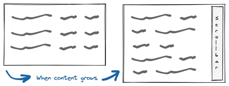
When an element becomes scrollable, as shown in the figure, the presence of the scrollbar affects the available width, which leads to the reflowing of content. Usually, this is a bad user experience. With Slab, this could happen easily as users write out their posts.
If you are using a Trackpad on macOS, scrollbars show as overlays, which don't have such problems. To see this issue, you can set the scrollbar to always show in System Preferences.
A new CSS property scrollbar-gutter can fix this issue. When set to stable, the scrollbar space is reserved even when the scrollbar itself is not needed/visible:
scrollbar-gutter: stable;It's currently not possible to draw over the reserved space, so it may not look good if there are elements on the page that extend to the full width of the container. You can find more information here.
Closing Thoughts
Delivering a great experience has always been a priority at Slab. We are excited that the above features make it easier to do that for our users.
Although it will be some time before all major browsers support the listed features, we are more optimistic than ever about the adaptation of new CSS technologies with the help of automatically updated browsers and polyfills provided by the web community. The browser vendors are placing increasing importance on Web standards compatibility and addressing developer pain points.
Interop 2022, for example, is a benchmark for evaluating how well browsers support certain key features. Some of the features described in this post, such as the cascade layers, are also included in the evaluation. The major browser vendors agreed on this benchmark and are working together to provide support. You can find the current level of support for each browser here.


